Tutorial 3: Splicing MPRA modeling using multiple built-in G-P maps
[1]:
# Standard imports
import numpy as np
import pandas as pd
import seaborn as sns
import matplotlib.pyplot as plt

# Import MAVE-NN
import mavenn

# Import Logomaker for visualization
import logomaker
In this tutorial we show how to train multiple models with different G-P maps on the same dataset. To this end we use the built-in 'mpsa' dataset, which contains data from the splicing MPRA of Wong et al. (2018). Next we show how to to compare the performance of these models, as in Figs. 5a-5d of Tareen et al. (2020). Finally, we demonstrate how to visualize the parameters of the 'pairwise' G-P map trained on these data; similar visualizations are shown in Figs. 5e and 5f of Tareen et
al. (2020).
Training multiple models
The models that we train each have a GE measurement process and one of four different types of G-P map: additive, neighbor, pairwise, or blackbox. The trained models are similar (though not identical) to the following built-in models, which can be loaded with mavenn.load_example_model():
'mpsa_additive_ge''mpsa_neighbor_ge''mpsa_pairwise_ge''mpsa_blackbox_ge'
First we load, split, and preview the built-in 'mpsa' dataset. We also compute the length of sequences in this dataset.
[2]:
# Load amyloid dataset
data_df = mavenn.load_example_dataset('mpsa')

# Get and report sequence length
L = len(data_df.loc[0,'x'])
print(f'Sequence length: {L:d} RNA nucleotides')

# Split dataset
trainval_df, test_df = mavenn.split_dataset(data_df)

# Preview trainval_df
print('\ntrainval_df:')
trainval_df
Sequence length: 9 RNA nucleotides
Training set   :   18,469 observations (  60.59%)
Validation set :    5,936 observations (  19.47%)
Test set       :    6,078 observations (  19.94%)
-------------------------------------------------
Total dataset  :   30,483 observations ( 100.00%)


trainval_df:
[2]:
| validation | tot_ct | ex_ct | y | x | |
|---|---|---|---|---|---|
| 0 | False | 28 | 2 | 0.023406 | GGAGUGAUG |
| 1 | False | 193 | 15 | -0.074999 | UUCGCGCCA |
| 2 | False | 27 | 0 | -0.438475 | UAAGCUUUU |
| 3 | False | 130 | 2 | -0.631467 | AUGGUCGGG |
| 4 | False | 552 | 19 | -0.433012 | AGGGCAGGA |
| ... | ... | ... | ... | ... | ... |
| 24400 | False | 167 | 1467 | 1.950100 | GAGGUAAAU |
| 24401 | False | 682 | 17 | -0.570465 | AUCGCUAGA |
| 24402 | False | 190 | 17 | -0.017078 | CUGGUUGCA |
| 24403 | False | 154 | 10 | -0.140256 | CGCGCACAA |
| 24404 | False | 265 | 6 | -0.571100 | AUAGUCUAA |
24405 rows × 5 columns
Next we instantiate and train our models. In order to train multiple different models in a consistent manner, we use dictionaries to specify default keyword arguments for model.Model() and model.fit(). Then for each type of G-P map we do the following:
Modify the hyperparameter dictionaries as desired.
Instantiate a model using these hyperparameters.
Set that model’s training data.
Train the parameters of that model.
Evaluate that model’s performance.
Save that model to disk.
[3]:
# Set default keyword arguments for model.Model()
default_model_kwargs = {
    'L':L,
    'alphabet':'rna',
    'regression_type':'GE',
    'ge_noise_model_type':'SkewedT',
    'ge_heteroskedasticity_order':2
}

# Set default keyword arguments for model.fit()
default_fit_kwargs = {
    'learning_rate':.001,
    'epochs':1000,
    'batch_size':200,
    'early_stopping':True,
    'early_stopping_patience':10,
    'linear_initialization':False,
    'verbose':False
}

# Iterate over types of G-P maps
gpmap_types = ['additive','neighbor','pairwise','blackbox']
print(f'Training {len(gpmap_types)} models: {gpmap_types}')
for gpmap_type in gpmap_types:

    # Set model name
    model_name = f'mpsa_{gpmap_type}_ge'
    print('-----------------------------')
    print(f"Training '{model_name}' model...")

    # Copy keyword arguments
    model_kwargs = default_model_kwargs.copy()
    fit_kwargs = default_fit_kwargs.copy()

    # Modify keyword arguments based on G-P map being trained
    # Note: the need for different hyperparameters, such as batch_size
    # and learning_rate, was found by trial and error.
    if gpmap_type=='additive': pass;
    elif gpmap_type=='neighbor': pass;
    elif gpmap_type=='pairwise':
        fit_kwargs['batch_size'] = 50
    elif gpmap_type=='blackbox':
        model_kwargs['gpmap_kwargs'] = {'hidden_layer_sizes':[10]*5,
                                        'features':'pairwise'}
        fit_kwargs['learning_rate'] = 0.0005
        fit_kwargs['batch_size'] = 50
        fit_kwargs['early_stopping_patience'] = 10

    # Instantiate model using the keyword arguments in model_kwargs dict
    model = mavenn.Model(gpmap_type=gpmap_type, **model_kwargs)

    # Set training data
    model.set_data(x=trainval_df['x'],
                   y=trainval_df['y'],
                   validation_flags=trainval_df['validation'])

    # Train model using the keyword arguments in fig_kwargs dict
    model.fit(**fit_kwargs)

    # Compute variational information on test data
    I_var, dI_var =  model.I_variational(x=test_df['x'], y=test_df['y'])
    print(f'test_I_var: {I_var:.3f} +- {dI_var:.3f} bits')

    # Compute predictive information on test data
    I_pred, dI_pred = model.I_predictive(x=test_df['x'], y=test_df['y'])
    print(f'test_I_pred: {I_pred:.3f} +- {dI_pred:.3f} bits')

    # Save model to file
    model.save(model_name)

print('Done!')
Training 4 models: ['additive', 'neighbor', 'pairwise', 'blackbox']
-----------------------------
Training 'mpsa_additive_ge' model...
N = 24,405 observations set as training data.
Using 24.3% for validation.
Data shuffled.
Time to set data: 0.207 sec.
Training time: 64.7 seconds
test_I_var: 0.208 +- 0.027 bits
test_I_pred: 0.238 +- 0.011 bits
Model saved to these files:
        mpsa_additive_ge.pickle
        mpsa_additive_ge.weights.h5
-----------------------------
Training 'mpsa_neighbor_ge' model...
N = 24,405 observations set as training data.
Using 24.3% for validation.
Data shuffled.
Time to set data: 0.205 sec.
Training time: 30.9 seconds
test_I_var: 0.303 +- 0.024 bits
test_I_pred: 0.345 +- 0.014 bits
Model saved to these files:
        mpsa_neighbor_ge.pickle
        mpsa_neighbor_ge.weights.h5
-----------------------------
Training 'mpsa_pairwise_ge' model...
N = 24,405 observations set as training data.
Using 24.3% for validation.
Data shuffled.
Time to set data: 0.201 sec.
Training time: 44.1 seconds
test_I_var: 0.300 +- 0.026 bits
test_I_pred: 0.362 +- 0.011 bits
Model saved to these files:
        mpsa_pairwise_ge.pickle
        mpsa_pairwise_ge.weights.h5
-----------------------------
Training 'mpsa_blackbox_ge' model...
N = 24,405 observations set as training data.
Using 24.3% for validation.
Data shuffled.
Time to set data: 0.206 sec.
Training time: 21.7 seconds
test_I_var: 0.412 +- 0.025 bits
test_I_pred: 0.459 +- 0.016 bits
Model saved to these files:
        mpsa_blackbox_ge.pickle
        mpsa_blackbox_ge.weights.h5
Done!
Visualizing model performance
To compare these models side-by-side, we first load them into a dictionary.
[4]:
# Iterate over types of G-P maps
gpmap_types = ['additive','neighbor','pairwise','blackbox']

# Create list of model names
model_names = [f'mpsa_{gpmap_type}_ge' for gpmap_type in gpmap_types]

# Load models into a dictionary indexed by model name
model_dict = {name:mavenn.load(name) for name in model_names}
Model loaded from these files:
        mpsa_additive_ge.pickle
        mpsa_additive_ge.weights.h5
Model loaded from these files:
        mpsa_neighbor_ge.pickle
        mpsa_neighbor_ge.weights.h5
Model loaded from these files:
        mpsa_pairwise_ge.pickle
        mpsa_pairwise_ge.weights.h5
Model loaded from these files:
        mpsa_blackbox_ge.pickle
        mpsa_blackbox_ge.weights.h5
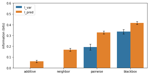
To compare the performance of these models, we plot variational and predictive information in the form of a bar chart similar to that shown in Fig. 5a of Tareen et al., (2021).
[5]:
# Fill out dataframe containing values to plot
# This dataframe will then be used by seaborn's barplot() function
info_df = pd.DataFrame(columns=['name', 'gpmap', 'metric', 'I', 'dI'])
row_list = []
for gpmap_type in gpmap_types:

    # Get model
    name = f'mpsa_{gpmap_type}_ge'
    model = model_dict[name]

    # Compute variational information on test data
    I_var, dI_var =  model.I_variational(x=test_df['x'], y=test_df['y'])
    row = {'name':name,
           'gpmap':gpmap_type,
           'metric':'I_var',
           'I':I_var,
           'dI':dI_var}
    row_list.append(row)

    # Compute predictive information on test data
    I_pred, dI_pred = model.I_predictive(x=test_df['x'], y=test_df['y'])
    row = {'name':name,
           'gpmap':gpmap_type,
           'metric':'I_pred',
           'I':I_pred,
           'dI':dI_pred}
    row_list.append(row)

# Convert row_list to DataFrame
info_df = pd.DataFrame(row_list)

# Print dataframe
print('Contents of info_df:', info_df, sep='\n')

# Create figure
fig, ax = plt.subplots(figsize=[8, 4])

# Plot bars
sns.barplot(ax=ax,
            data=info_df,
            hue='metric',
            x='gpmap',
            y='I')

# Plot errorbars
x = np.array([[x-.2,x+.2] for x in range(4)]).ravel()
ax.errorbar(x=x,
            y=info_df['I'].values,
            yerr=info_df['dI'].values,
            color='k', capsize=3, linestyle='none',
            elinewidth=1, capthick=1, solid_capstyle='round')

ax.set_ylabel('information (bits)')
ax.set_xlabel('')
ax.set_xlim([-.5, 3.5])
ax.set_ylim([0, 0.6])
ax.legend(loc='upper left')
Contents of info_df:
               name     gpmap  metric         I        dI
0  mpsa_additive_ge  additive   I_var  0.216834  0.023122
1  mpsa_additive_ge  additive  I_pred  0.219266  0.014210
2  mpsa_neighbor_ge  neighbor   I_var  0.309836  0.027069
3  mpsa_neighbor_ge  neighbor  I_pred  0.341439  0.012986
4  mpsa_pairwise_ge  pairwise   I_var  0.306635  0.024523
5  mpsa_pairwise_ge  pairwise  I_pred  0.357971  0.013754
6  mpsa_blackbox_ge  blackbox   I_var  0.397610  0.025213
7  mpsa_blackbox_ge  blackbox  I_pred  0.455325  0.013984
[5]:
<matplotlib.legend.Legend at 0x15e33ee40>
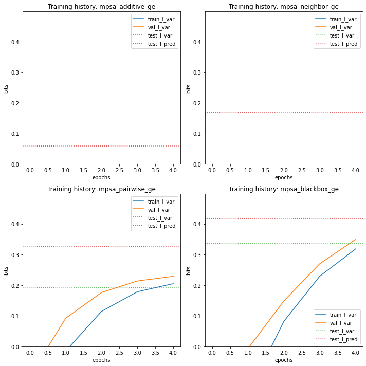
It can also be useful to observe the training history of each model in relation to performance metrics on the test set.
[6]:
# Create figure and axes for plotting
fig, axs = plt.subplots(2,2,figsize=[10,10])
axs = axs.ravel()

# Loop over models
for ax, name in zip(axs, model_names):

    # Get model
    model = model_dict[name]

    # Plot I_var_train, the variational information on training data as a function of epoch
    ax.plot(model.history['I_var'],
            label=r'train_I_var')

    # Plot I_var_val, the variational information on validation data as a function of epoch
    ax.plot(model.history['val_I_var'],
            label=r'val_I_var')

    # Get part of info_df referring to this model and index by metric
    ix = (info_df['name']==name)
    sub_df = info_df[ix].set_index('metric')

    # Show I_var_test, the variational information of the final model on test data
    ax.axhline(sub_df.loc['I_var','I'], color='C2', linestyle=':',
               label=r'test_I_var')

    # Show I_pred_test, the predictive information of the final model on test data
    ax.axhline(sub_df.loc['I_pred','I'], color='C3', linestyle=':',
               label=r'test_I_pred')

    # Style plot
    ax.set_xlabel('epochs')
    ax.set_ylabel('bits')
    ax.set_title(f'Training history: {name}')
    ax.set_ylim([0, 1.2*I_pred])
    ax.legend()

# Clean up figure
fig.tight_layout()
Next we visualize the GE measurement process inferred as part of our each latent phenotype model, comparing it to the test data.
[7]:
# Create figure and axes for plotting
fig, axs = plt.subplots(2,2,figsize=[10,10])
axs = axs.ravel()

# Loop over models
for ax, name in zip(axs, model_names):

    # Get model
    model = model_dict[name]

    # Get test data y values
    y_test = test_df['y']

    # Compute phi on test data
    phi_test = model.x_to_phi(test_df['x'])

    ## Set phi lims and create a grid in phi space
    phi_lim = [min(phi_test)-.5, max(phi_test)+.5]
    phi_grid = np.linspace(phi_lim[0], phi_lim[1], 1000)

    # Compute yhat for each phi gridpoint
    yhat_grid = model.phi_to_yhat(phi_grid)

    # Compute 95% CI for each yhat
    q = [0.025, 0.975]
    yqs_grid = model.yhat_to_yq(yhat_grid, q=q)

    # Plote 95% confidence interval
    ax.fill_between(phi_grid, yqs_grid[:, 0], yqs_grid[:, 1],
                    alpha=0.2, color='C1', lw=0, label='95% CI')

    # Plot GE nonlinearity
    ax.plot(phi_grid, yhat_grid,
            linewidth=3, color='C1', label='nonlinearity')

    # Plot scatter of phi and y values.
    ax.scatter(phi_test, y_test,
               color='C0', s=10, alpha=.3, label=r'test data', zorder=-100)

    # Style plot
    ax.set_xlim(phi_lim)
    ax.set_xlabel(r'latent phenotype ($\phi$)')
    ax.set_ylim([-1.5,2.5])
    ax.set_ylabel(r'measurement ($y$)')
    ax.set_title(rf'Measurement process: {name}')
    ax.legend(loc='lower right')

fig.tight_layout()
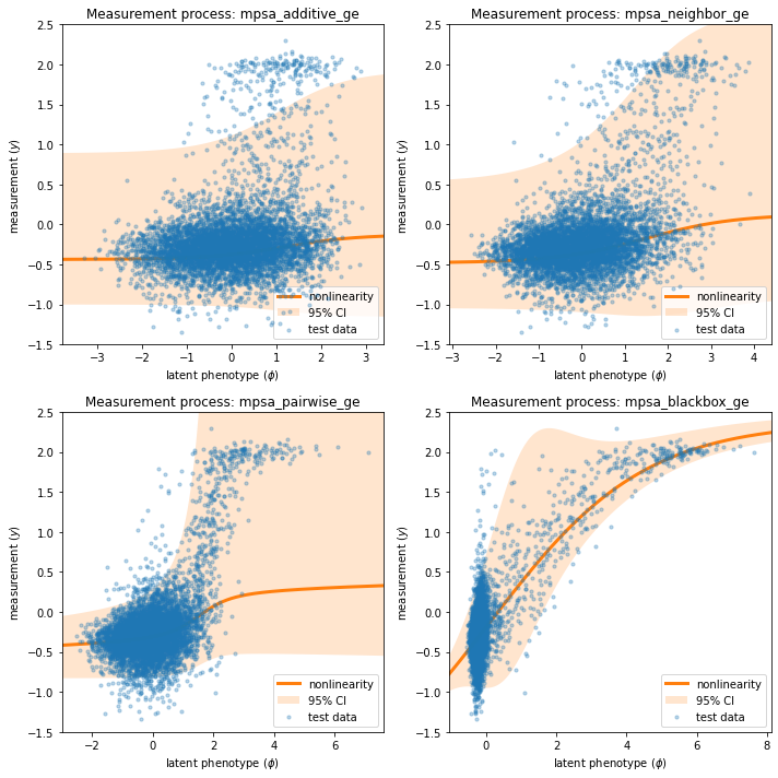
Note that the measurement processes for all of the linear models ('additive', 'neighbor', 'pairwise') are similar, while that of the 'blackbox' model is quite different. This distinct behavior is due to the presence of nonlinearities in the 'blackbox' G-P map that are not present in the other three.
Visualizing pairwise model parameters
We now focus on visualizing the pairwise model. The mathematical formula for the pairwise G-P map is:
To retrieve the values of each model’s G-P map parameters, we use the method model.get_theta(), which returns a dictionary listing the various model parameter values. Because the sequence library spans nearly all possible 9nt 5’ splice sites, rather than being clustered around a single wild-type sequence, we choose to insect the parameters using the “uniform” gauge.
[8]:
# Focus on pairwise model
model = model_dict['mpsa_pairwise_ge']

# Retrieve G-P map parameter dict and view dict keys
theta_dict = model.get_theta(gauge="uniform")
theta_dict.keys()
[8]:
dict_keys(['L', 'C', 'alphabet', 'theta_0', 'theta_lc', 'theta_lclc', 'theta_mlp', 'logomaker_df'])
Among the keys of the dict returned by model.get_theta():
'theta_0': a single number representing the constant component, \(\theta_0\), of a linear model.'theta_lc': an \(L\) x \(C\) matrix representing the additive parameters, \(\theta_{l:c}\), of a linear model.'logomaker_df': An \(L\) x \(C\) dataframe containing the additive parameters in a dataframe that facilitates visualization usinglogomaker.'theta_lclc': an \(L\) x \(C\) x \(L\) x \(C\) tensor representing the pairwise parameters, \(\theta_{l:c,l':c'}\), of a linear model; is nonzero only for neighbor and pairwise models.'theta_mlp': a dictionary containing the parameters of the blackbox MLP model, if indeed this is the model that is fit.
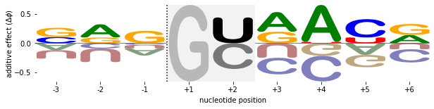
We first visualize the additive component of this model using a sequence logo, which we render using Logomaker (Tareen & Kinney, 2019). Note that the characters at positions +1 and +2 (corresponding to logo indices 3 and 4) are illustrated in a special manner due to library sequences having only a 'G' at position +1 and a 'C' or ‘U' at position +2.
[11]:
# Get logo dataframe
logo_df = theta_dict['logomaker_df']

# Set NaN parameters to zero
logo_df.fillna(0, inplace=True)

# Create figure
fig, ax = plt.subplots(figsize=[4,2])

# Draw logo
logo = logomaker.Logo(df=logo_df,
                      ax=ax,
                      fade_below=.5,
                      shade_below=.5,
                      width=.9,
                      font_name='Arial Rounded MT Bold')
ylim = ax.get_ylim()

# Highlight positions +1 and +2 to gray to indicate incomplete mutagenesis at these positions
logo.highlight_position_range(pmin=3, pmax=4, color='w', alpha=1, zorder=10)
logo.highlight_position_range(pmin=3, pmax=4, color='gray', alpha=.1, zorder=11)

# Create a large `G` at position +1 to indicate that only this base was present in the sequences under consideration
logo.style_single_glyph(p=3,
                        c='G',
                        flip=False,
                        floor=ylim[0],
                        ceiling=ylim[1],
                        color='gray',
                        zorder=30,
                        alpha=.5)

# Make 'C' and 'U' at position +2 black
logo.style_single_glyph(p=4, c='U', color='k', zorder=30, alpha=1)
logo.style_single_glyph(p=4, c='C', color='k', zorder=30, alpha=.5)

# Style logo
logo.style_spines(visible=False)
ax.axvline(2.5, linestyle=':', color='k', zorder=30)
ax.set_ylabel(r'additive effect ($\Delta \phi$)', labelpad=-1)
ax.set_xticks([0,1,2,3,4,5,6,7,8])
ax.set_xticklabels([f'{x:+d}' for x in range(-3,7) if x!=0])
ax.set_xlabel(r'nucleotide position', labelpad=5);
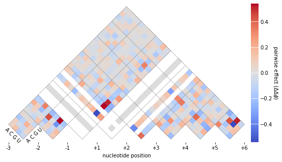
To visualize the pariwise parameters, we use the built-in function mavenn.heatmap_pariwise().
[12]:
# Get pairwise parameters from theta_dict
theta_lclc = theta_dict['theta_lclc']

# Create fig and ax objects
fig, ax = plt.subplots(figsize=[10,5])

# Draw heatmap
ax, cb = mavenn.heatmap_pairwise(values=theta_lclc,
                                 alphabet='rna',
                                 ax=ax,
                                 gpmap_type='pairwise',
                                 cmap_size='3%')

# Style heatmap
ax.set_xticks([0,1,2,3,4,5,6,7,8])
ax.set_xticklabels([f'{x:+d}' for x in range(-3,7) if x!=0])
ax.set_xlabel(r'nucleotide position', labelpad=5)

# Style colorbar
cb.set_label(r'pairwise effect ($\Delta \Delta \phi$)',
             labelpad=5, ha='center', va='center', rotation=-90)
cb.outline.set_visible(False)
cb.ax.tick_params(direction='in', size=20, color='white')
References
Wong MS, Kinney JB, Krainer AR. Quantitative activity profile and context dependence of all human 5’ splice sites. Mol Cell 71:1012-1026.e3 (2018).
Tareen A, Kooshkbaghi M, Posfai A, Ireland WT, McCandlish DM, Kinney JB. MAVE-NN: learning genotype-phenotype maps from multiplex assays of variant effect. bioRxiv doi:10.1101/2020.07.14.201475 (2020).
Tareen A, Kinney JB. Logomaker: beautiful sequence logos in Python. Bioinformatics 36:2272–2274 (2019).
[ ]: