Tutorial 2: Protein DMS modeling using additive G-P maps
This tutorial covers perhaps the simplest application of MAVE-NN: the modeling of DMS data using an additive genotype-phenotype (G-P) map together with a global epistasis (GE) measurement process. The code below steps users through this process, and can be used to train models similar to the following built-in models, which are accessible using mavenn.load_example_model():
'amyloid_additive_ge''tdp43_additive_ge''gb1_additive_ge'
[1]:
# Standard imports
import numpy as np
import matplotlib.pyplot as plt

# Import MAVE-NN
import mavenn
Training
First we choose which dataset we wish to model, and we load it as a Pandas dataframe using mavenn.load_example_dataset(). We then compute the length of sequences in that dataset; we will need this quantity for defining the architecture of our model.
[2]:
# Choose dataset
# dataset_name = 'amyloid'  # From Seuma et al., 2021
dataset_name = 'tdp43'    # From Bolognesi et al., 2019
# dataset_name = 'gb1'      # From Olson et al., 2021. (Slowest)
print(f"Loading dataset '{dataset_name}' ")

# Load datset
data_df = mavenn.load_example_dataset(dataset_name)

# Get and report sequence length
L = len(data_df.loc[0,'x'])
print(f'Sequence length: {L:d} amino acids (+ stops)')

# Preview dataset
print('data_df:')
data_df
Loading dataset 'tdp43'
Sequence length: 84 amino acids (+ stops)
data_df:
[2]:
| set | dist | y | dy | x | |
|---|---|---|---|---|---|
| 0 | training | 1 | 0.032210 | 0.037438 | NNSRGGGAGLGNNQGSNMGGGMNFGAFSINPAMMAAAQAALQSSWG... |
| 1 | training | 1 | -0.009898 | 0.038981 | TNSRGGGAGLGNNQGSNMGGGMNFGAFSINPAMMAAAQAALQSSWG... |
| 2 | training | 1 | -0.010471 | 0.005176 | RNSRGGGAGLGNNQGSNMGGGMNFGAFSINPAMMAAAQAALQSSWG... |
| 3 | training | 1 | 0.030803 | 0.005341 | SNSRGGGAGLGNNQGSNMGGGMNFGAFSINPAMMAAAQAALQSSWG... |
| 4 | training | 1 | -0.054716 | 0.035752 | INSRGGGAGLGNNQGSNMGGGMNFGAFSINPAMMAAAQAALQSSWG... |
| ... | ... | ... | ... | ... | ... |
| 57991 | training | 2 | -0.009706 | 0.035128 | GNSRGGGAGLGNNQGSNMGGGMNFGAFSINPAMMAAAQAALQSSWG... |
| 57992 | validation | 2 | -0.030744 | 0.029436 | GNSRGGGAGLGNNQGSNMGGGMNFGAFSINPAMMAAAQAALQSSWG... |
| 57993 | validation | 2 | -0.086802 | 0.033174 | GNSRGGGAGLGNNQGSNMGGGMNFGAFSINPAMMAAAQAALQSSWG... |
| 57994 | training | 2 | -0.049587 | 0.029130 | GNSRGGGAGLGNNQGSNMGGGMNFGAFSINPAMMAAAQAALQSSWG... |
| 57995 | training | 2 | -0.105390 | 0.031189 | GNSRGGGAGLGNNQGSNMGGGMNFGAFSINPAMMAAAQAALQSSWG... |
57996 rows × 5 columns
Next we use the built-in function mavenn.split_dataset() to split our dataset into two dataframes:
trainval_df, which contains both the training set and **validation set* data.test_df, which contains only the test set data.
Note that training_df, previewed below, includes an extra column called 'validation' that flags which sequences are reserved for the validation set.
[3]:
# Split dataset
trainval_df, test_df = mavenn.split_dataset(data_df)

# Preview trainval_df
print('trainval_df:')
trainval_df
Training set   :   52,249 observations (  90.09%)
Validation set :    2,916 observations (   5.03%)
Test set       :    2,831 observations (   4.88%)
-------------------------------------------------
Total dataset  :   57,996 observations ( 100.00%)

trainval_df:
[3]:
| validation | dist | y | dy | x | |
|---|---|---|---|---|---|
| 0 | False | 1 | 0.032210 | 0.037438 | NNSRGGGAGLGNNQGSNMGGGMNFGAFSINPAMMAAAQAALQSSWG... |
| 1 | False | 1 | -0.009898 | 0.038981 | TNSRGGGAGLGNNQGSNMGGGMNFGAFSINPAMMAAAQAALQSSWG... |
| 2 | False | 1 | -0.010471 | 0.005176 | RNSRGGGAGLGNNQGSNMGGGMNFGAFSINPAMMAAAQAALQSSWG... |
| 3 | False | 1 | 0.030803 | 0.005341 | SNSRGGGAGLGNNQGSNMGGGMNFGAFSINPAMMAAAQAALQSSWG... |
| 4 | False | 1 | -0.054716 | 0.035752 | INSRGGGAGLGNNQGSNMGGGMNFGAFSINPAMMAAAQAALQSSWG... |
| ... | ... | ... | ... | ... | ... |
| 55160 | False | 2 | -0.009706 | 0.035128 | GNSRGGGAGLGNNQGSNMGGGMNFGAFSINPAMMAAAQAALQSSWG... |
| 55161 | True | 2 | -0.030744 | 0.029436 | GNSRGGGAGLGNNQGSNMGGGMNFGAFSINPAMMAAAQAALQSSWG... |
| 55162 | True | 2 | -0.086802 | 0.033174 | GNSRGGGAGLGNNQGSNMGGGMNFGAFSINPAMMAAAQAALQSSWG... |
| 55163 | False | 2 | -0.049587 | 0.029130 | GNSRGGGAGLGNNQGSNMGGGMNFGAFSINPAMMAAAQAALQSSWG... |
| 55164 | False | 2 | -0.105390 | 0.031189 | GNSRGGGAGLGNNQGSNMGGGMNFGAFSINPAMMAAAQAALQSSWG... |
55165 rows × 5 columns
Now we specify the architecture of the model we wish to train . To do this, we create an instance of the mavenn.Model class, called model, using the following keyword arguments:
L=Lspecifies the sequence length.alphabet='protein*'specifies that the alphabet our sequences are built from consists of 21 characters representing the 20 amino acids plus a stop signal (which is represented by the character'*'). Other possible choices foralphabetare'dna','rna', and'protein'.gpmap_type='additive'specifies that we wish to infer an additive G-P map.regression_type='GE'specifies that our model will have a global epistasis (GE) measurement process. We choose this because our MAVE measurements are continuous real numbers.ge_noise_model_type='SkewedT'specifies the use of a skewed-t noise model in the GE measurement process. The'SkewedT'noise model can accommodate asymmetric noise and is thus more flexible than the default'Gaussian'noise model.ge_heteroskedasticity_order=2specifies that the noise model parameters (the three parameters of the skewed-t distribution) are each modeled using quadratic functions of the predicted measurement \(\hat{y}\). This will allow our model of experimental noise to vary with signal intensity.
We then set the training data by calling model.set_data(). The keyword argument 'validation_flags' is used to specify which subset of the data in trainval_df will be used for validation (as opposed to stochastic gradient descent).
Next we train the model by calling model.fit(). In doing so we specify a number of hyperparameters including the learning rate, the number of epochs, the batch size, whether to use early stopping, and the early stopping patience. We also set verbose=False to limit the amount of user feedback.
Choosing hyperparameters is somewhat of an art, and the particular values used here were found by trial and error. In general users will have to try a number of different values for these and possibly other hyperparameters in order to find ones that work well. We recommend that users choose these hyperparameters in order to maximize the final value for val_I_var, the variational information of the trained model on the validation dataset.
[4]:
# Define model
model = mavenn.Model(L=L,
                     alphabet='protein*',
                     gpmap_type='additive',
                     regression_type='GE',
                     ge_noise_model_type='SkewedT',
                     ge_heteroskedasticity_order=2)

# Set training data
model.set_data(x=trainval_df['x'],
               y=trainval_df['y'],
               validation_flags=trainval_df['validation'])

# Train model
model.fit(learning_rate=1e-3,
          epochs=500,
          batch_size=64,
          early_stopping=True,
          early_stopping_patience=25,
          verbose=False);
N = 55,165 observations set as training data.
Using 5.3% for validation.
Data shuffled.
Time to set data: 1.02 sec.
Training time: 137.7 seconds
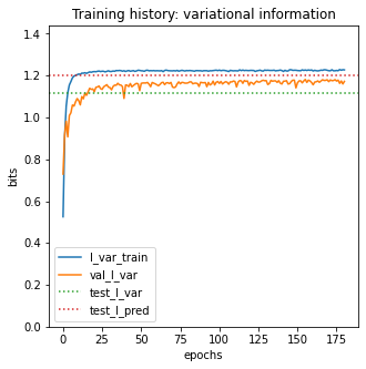
To assess the performance of our final trained model, we compute two different metrics on test data: variational information and predictive information. Variational information quantifies the performance of the full latent phenotype model (G-P map + measurement process), whereas predictive information quantifies the performance of just the G-P map. See Tareen et al. (2021) for an expanded discussion of these quantities.
Note that MAVE-NN also estimates the standard errors for these quantities.
[5]:
# Compute variational information on test data
I_var, dI_var =  model.I_variational(x=test_df['x'], y=test_df['y'])
print(f'test_I_var: {I_var:.3f} +- {dI_var:.3f} bits')

# Compute predictive information on test data
I_pred, dI_pred = model.I_predictive(x=test_df['x'], y=test_df['y'])
print(f'test_I_pred: {I_pred:.3f} +- {dI_pred:.3f} bits')
test_I_var: 1.841 +- 0.037 bits
test_I_pred: 2.042 +- 0.023 bits
To save the trained model we call model.save(). This records our model in two separate files: a pickle file that defines model architecture (extension '.pickle'), and an H5 file that records model parameters (extension '.h5').
[6]:
# Save model to file
model_name = f'{dataset_name}_additive_ge'
model.save(model_name)
Model saved to these files:
        tdp43_additive_ge.pickle
        tdp43_additive_ge.weights.h5
Visualization
We now discuss how to visualize the training history, performance, and parameters of a trained model. First we then load our model using mavenn.load:
[7]:
# Delete model if it is present in memory
try:
    del model
except:
    pass

# Load model from file
model = mavenn.load(model_name)
Model loaded from these files:
        tdp43_additive_ge.pickle
        tdp43_additive_ge.weights.h5
The model.history attribute is a dict that contains values for multiple model performance metrics as a function of training epoch, each evaluated on both the training data and the validation data. 'loss' and 'val_loss' record loss values, while 'I_var' and 'val_I_var' record the variational information values. As described in Tareen et al. (2021), these metrics are closely related: variational information is an affine transformation of the per-datum log likelihood, whereas
loss is equal to negative log likelihood plus regularization terms.
[8]:
# Show metrics recorded in model.history()
model.history.keys()
[8]:
dict_keys(['loss', 'val_loss', 'I_var', 'val_I_var'])
Plotting 'I_var' and 'val_I_var' versus epoch can often provide insight into the model training process.
[9]:
# Create figure and axes for plotting
fig, ax = plt.subplots(1,1,figsize=[5,5])

# Plot I_var_train, the variational information on training data as a function of epoch
ax.plot(model.history['I_var'],
        label=r'I_var_train')

# Plot I_var_val, the variational information on validation data as a function of epoch
ax.plot(model.history['val_I_var'],
        label=r'val_I_var')

# Show I_var_test, the variational information of the final model on test data
ax.axhline(I_var, color='C2', linestyle=':',
           label=r'test_I_var')

# Show I_pred_test, the predictive information of the final model on test data
ax.axhline(I_pred, color='C3', linestyle=':',
           label=r'test_I_pred')

# Style plot
ax.set_xlabel('epochs')
ax.set_ylabel('bits')
ax.set_title('Training history: variational information')
ax.set_ylim([0, 1.2*I_pred])
ax.legend()
[9]:
<matplotlib.legend.Legend at 0x169b34140>
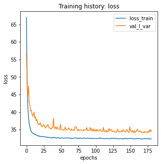
Users can also plot ‘loss’ and ‘var_loss’ if they like, though the absolute values these quantities are be more difficult to interpret than 'I_var' and 'val_I_var'.
[10]:
# Create figure and axes for plotting
fig, ax = plt.subplots(1,1,figsize=[5,5])

# Plot loss_train, the loss computed on training data as a function of epoch
ax.plot(model.history['loss'],
        label=r'loss_train')

# Plot loss_val, the loss computed on validation data as a function of epoch
ax.plot(model.history['val_loss'],
        label=r'val_I_var')

# Style plot
ax.set_xlabel(r'epochs')
ax.set_ylabel(r'loss')
ax.set_title(r'Training history: loss')
ax.legend()
[10]:
<matplotlib.legend.Legend at 0x1764f3e00>
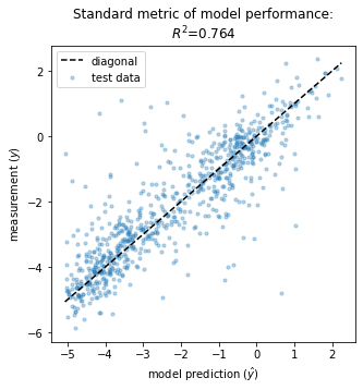
It is also useful to consider more traditional metrics of model performance. In the context of GE models, a natural choice is the squared Pearson correlation, \(R^2\), between measurements \(y\) and model predictions \(\hat{y}\):
[11]:
# Create figure and axes for plotting
fig, ax = plt.subplots(1,1,figsize=[5,5])

# Get test data y values
y_test = test_df['y']

# Compute yhat on test data
yhat_test = model.x_to_yhat(test_df['x'])

# Compute R^2 between yhat_test and y_test
Rsq = np.corrcoef(yhat_test.ravel(), test_df['y'])[0, 1]**2

# Plot y_test vs. yhat_test
ax.scatter(yhat_test, y_test, color='C0', s=10, alpha=.3,
           label='test data')

# Style plot
xlim = [min(yhat_test), max(yhat_test)]
ax.plot(xlim, xlim, '--', color='k', label='diagonal', zorder=100)
ax.set_xlabel(r'model prediction ($\hat{y}$)')
ax.set_ylabel(r'measurement ($y$)')
ax.set_title(rf'Standard metric of model performance:\n$R^2$={Rsq:.3}');
ax.legend()
[11]:
<matplotlib.legend.Legend at 0x176542090>
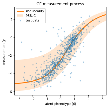
Next we visualize the GE measurement process inferred as part of our latent phenotype model. Recall from Tareen et al. (2021) that the measurement process consists of
A nonlinearity \(\hat{y} = g(\phi)\) that deterministically maps the latent phenotype \(\phi\) to a prediction \(\hat{y}\).
A noise model \(p(y|\hat{y})\) that stochastically maps predictions \(\hat{y}\) to measurements \(y\).
We can conveniently visualize both of these quantities in a single “global epistatsis plot”:
[12]:
# Create figure and axes for plotting
fig, ax = plt.subplots(1,1,figsize=[5,5])

# Get test data y values
y_test = test_df['y']

# Compute φ on test data
phi_test = model.x_to_phi(test_df['x'])

## Set phi lims and create a grid in phi space
phi_lim = [min(phi_test)-.5, max(phi_test)+.5]
phi_grid = np.linspace(phi_lim[0], phi_lim[1], 1000)

# Compute yhat each phi gridpoint
yhat_grid = model.phi_to_yhat(phi_grid)

# Compute 95% CI for each yhat
q = [0.025, 0.975]
yqs_grid = model.yhat_to_yq(yhat_grid, q=q)


# Plote 95% confidence interval
ax.fill_between(phi_grid, yqs_grid[:, 0], yqs_grid[:, 1],
               alpha=0.2, color='C1', lw=0, label='95% CI')

# Plot GE nonlinearity
ax.plot(phi_grid, yhat_grid,
        linewidth=3, color='C1', label='nonlinearity')

# Plot scatter of φ and y values,
ax.scatter(phi_test, y_test,
           color='C0', s=10, alpha=.3, label='test data',
           zorder=-100, rasterized=True)

# Style plot
ax.set_xlim(phi_lim)
ax.set_xlabel(r'latent phenotype ($\phi$)')
ax.set_ylabel(r'measurement ($y$)')
ax.set_title(r'GE measurement process')
ax.legend()
fig.tight_layout()
To retrieve the values of our model’s G-P map parameters, we use the method model.get_theta(). This returns a dictionary:
[13]:
# Retrieve G-P map parameter dict and view dict keys
theta_dict = model.get_theta(gauge='consensus')
theta_dict.keys()
[13]:
dict_keys(['L', 'C', 'alphabet', 'theta_0', 'theta_lc', 'theta_lclc', 'theta_mlp', 'logomaker_df'])
It is important to appreciate that G-P maps usually have many non-identifiable directions in parameter space. These are called gauge freedoms. Interpreting the values of model parameters requires that we first “pin down” these gauge freedoms by using a clearly specified convention. Specifying gauge='consensus' in model.get_theta() accomplishes this fixing all the \(\theta_{l:c}\) parameters that contribute to the consensus sequence to zero. This convention allows all the other
\(\theta_{l:c}\) parameters in the additive model to be interpreted as single-mutation effects, \(\Delta \phi\), away from the consensus sequence.
Finally, we use mavenn.heatmap() to visualize these additive parameters. This function takes a number of keyword arguments, which we summarize here. More information can be found in this function’s docstring.
ax=ax: specifies the axes on which to draw both the heatmap and the colorbar.values=theta_dict['theta_lc']: specifies the additive parameters in the form of anp.arrayof sizeLxC, whereCis the alphabet size.alphabet=theta_dict['alphabet']: provides a list of characters corresponding to the columns ofvaluesseq=model.x_stats['consensus_seq']: causesmavenn.heatmap()to highlight the characters of a specific sequence of interest. In our case this is the consensus sequence, the additive parameters for which are all fixed to zero.seq_kwargs={'c':'gray', 's':25}: provides a keyword dictionary to pass toax.scatter(); this specifies how the characters of the sequence of interest are to be graphically indicated.cmap='coolwarm': specifies the colormap used to represent the values of the additive parameters.cbar=True: specifies that a colorbar be drawn.cmap_size='2%': specifies the width of the colorbar relative to the enclosing ax object.cmap_pad=.3: specifies the spacing between the heatmap and the colorbar.ccenter=0: centers the colormap at zero.
This function returns two objects:
heatmap_axis the axes object on which the heatmap is drawn.cbis the colorbar object; it’s corresponding axes is given bycb.ax.
[14]:
# Create figure
fig, ax = plt.subplots(1,1, figsize=(12,5))

# Draw heatmap
heatmap_ax, cb = mavenn.heatmap(ax=ax,
                                values=theta_dict['theta_lc'],
                                alphabet=theta_dict['alphabet'],
                                seq=model.x_stats['consensus_seq'],
                                seq_kwargs={'c':'gray', 's':25},
                                cmap='coolwarm',
                                cbar=True,
                                cmap_size='2%',
                                cmap_pad=.3,
                                ccenter=0)
# Style heatmap (can be different between two dataset)
#heatmap_ax.set_xticks()
heatmap_ax.tick_params(axis='y', which='major', pad=10)
heatmap_ax.set_xlabel(r'position ($l$)')
heatmap_ax.set_ylabel(r'amino acid ($c$)')
heatmap_ax.set_title(rf'Additive parameters: {model_name}')

# Style colorbar
cb.outline.set_visible(False)
cb.ax.tick_params(direction='in', size=20, color='white')
cb.set_label(r'mutational effect ($\Delta \phi$)', labelpad=5, rotation=-90, ha='center', va='center')

# Adjust figure and show
fig.tight_layout(w_pad=5)
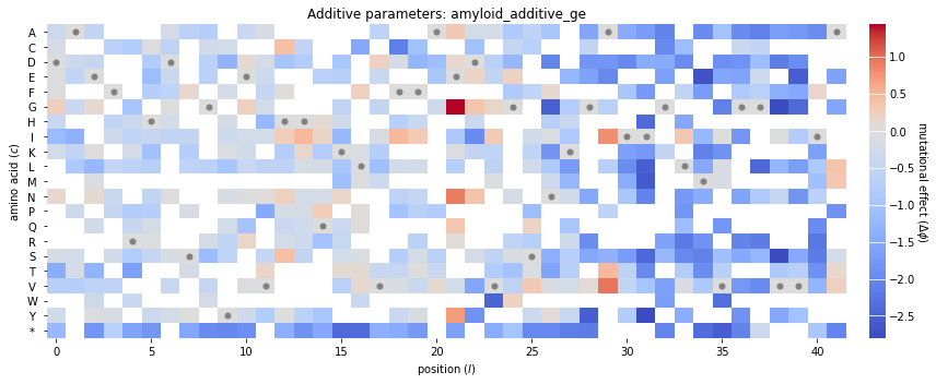
Note that many of the squares in the heatmap are white. These correspond to additive parameters whose values are NaN. MAVE-NN sets the values of a feature effect to NaN when no variant in the training set exhibits that feature. Such NaN parameters are common as DMS libraries often do not contain a comprehensive set of single-amino-acid mutations.
References
Bolognesi B, Faure AJ, Seuma M, Schmiedel JM, Tartaglia GG, Lehner B. The mutational landscape of a prion-like domain. Nat Commun 10:4162 (2019).
Olson CA, Wu NC, Sun R. A comprehensive biophysical description of pairwise epistasis throughout an entire protein domain. Curr Biol 24:2643–2651 (2014).
Seuma M, Faure A, Badia M, Lehner B, Bolognesi B. The genetic landscape for amyloid beta fibril nucleation accurately discriminates familial Alzheimer’s disease mutations. eLife 10:e63364 (2021).
Tareen A, Kooskhbaghi M, Posfai A, Ireland WT, McCandlish DM, Kinney JB. MAVE-NN: learning genotype-phenotype maps from multiplex assays of variant effect. bioRxiv doi:10.1101/2020.07.14.201475 (2020).